|
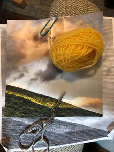
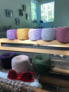
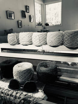
One of the most delightful aspects of tapestry development is the planning--the dreaming and playing. I love to pull down yarn balls and juxtapose them in different combinations--in relation to each other and sometimes in relation to source material. The moment a color "clicks in," it is all over for me--I am in love. What do I mean by a color "clicking in?" While I do study and contemplate color theory, and try to abide by its certain injunctions, there comes a moment when colors in relationship become another entity, when their combination results in something much greater than the sum of their parts. And it is like tumblers on a lock dropping into place. Sometimes this happens in "violation" of color theory expectations, and I move a color aside, thinking "no, no, no, that shouldn't work." And I fuss and fuss with other colors and usually come back to that first color moment-- that ka-thunk when the initial colors first hugged. So, that being said, what are the cool red glasses for? Desirous of being sensitive to the relative values of yarns used in a tapestry, I use the glasses to negate the colors, stripping them down to their value to see if they are close in value for blending, or farther apart in value for good contrast.
I could maybe figure this out by squinting at the colors for a long time, or holding them up to a greyscale card one by one. But the red glasses are easier, certainly more fashionable, and there is nothing quite like looking through them out the studio window at sunset time.
0 Comments
|
carolShares about the process. archives
July 2021
topics
All
|


 RSS Feed